
My process began with the intention of creating a monogram type Personal Logo, incorporating my Initials, S & Y. of course...
I wanted it to have a flowing, organic feel, so I played around with some handwritten styles, like cursive, to get a feel of a connection between the letters.
I noticed the proximity between the head of the 'S' and 'Y'. If connected, this wouldn't affect the legibility of the individual letters, so I ran with it!
I ventured into the realm of symmetry and developed a more abstract interpretation of our letters.
Using 3 organic shapes, and with the use of negative space, I came up with this little guy below!

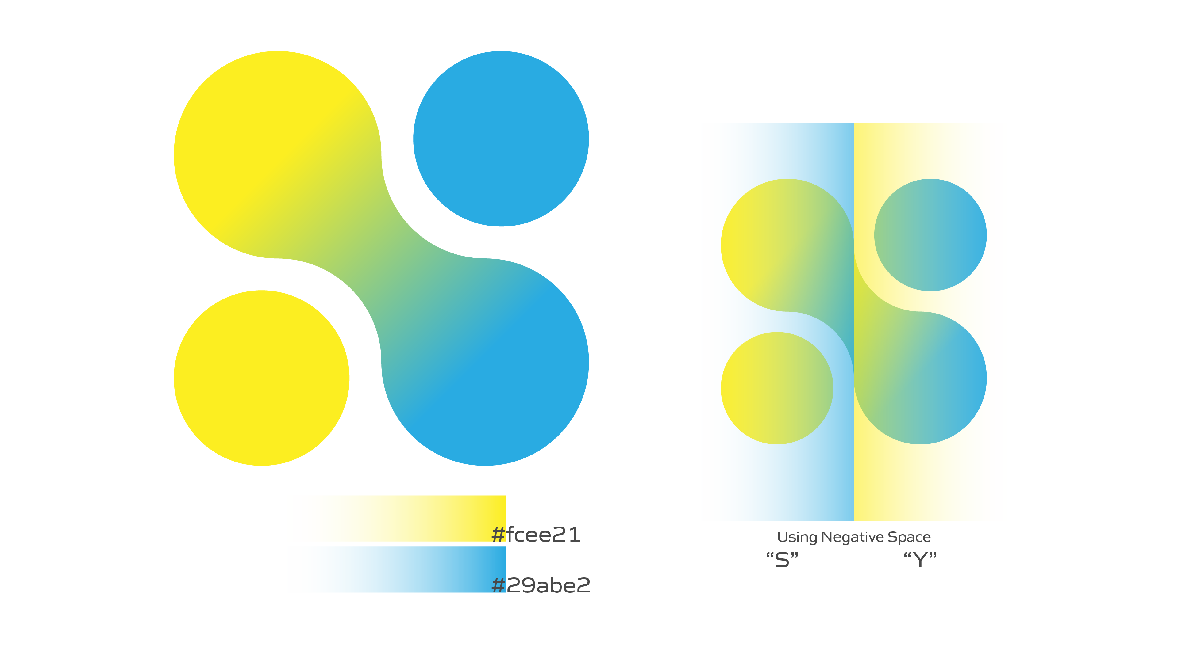
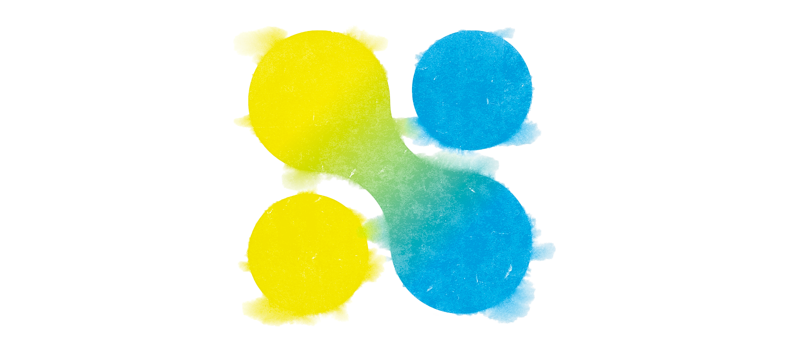
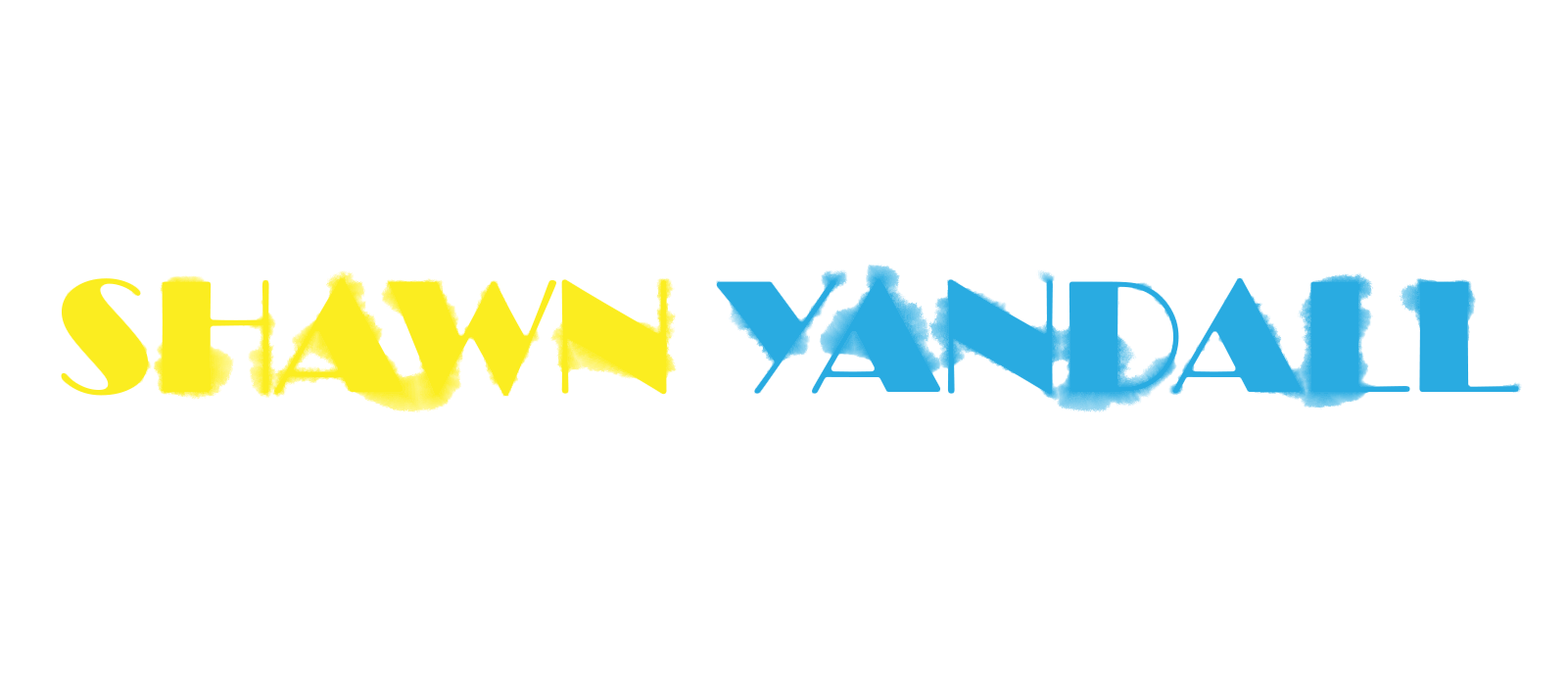
With my design set, I wanted to incorporate colors that had meaning. Also, contrasting colors that would translate from a greyscale easily.
I chose 2 saturated colors; a bright Yellow, and a nice cool Powder Blue.
These colors were almost synonymous with San Diego as I grew up. Representing my city, and could be recognized by almost anyone across the country.
To me these colors represent the Sunshine and Blue Sky.
A state-of-mind.
I chose 2 saturated colors; a bright Yellow, and a nice cool Powder Blue.
These colors were almost synonymous with San Diego as I grew up. Representing my city, and could be recognized by almost anyone across the country.
To me these colors represent the Sunshine and Blue Sky.
A state-of-mind.